- May 19, 2022
- Posted by: adam
- Category: Marketing + Branding

Whether you’re running a one-person or 1,000-person company, you’ve got a brand. And all brands need to be maintained and protected to do their job. With the importance of social media and digital marketing, your brand plays a significant role in your company’s relationships. It’s the face of your organization, setting the tone for your conversations and directing the attention of your prospective buyers and prospective talent.
When protecting your brand, you need to have a grasp on what to look for when evaluating your visual content —whether it’s a website, case study, or social card. It doesn’t matter if you have an in-house designer or work with a contractor to help you develop your branded content; either way, use a clear set of basic standards to evaluate the quality of your digital or print content.
Understanding these concepts has become even more crucial as DIY graphic design programs like Canva have cropped up, making it extremely easy for anyone to create branded/designed content regardless of training. Here are five basic design principles that will help you evaluate the quality of any design.
1. Consistency
One of the most fundamental concepts behind a brand is that it’s made up of similar, recognizable visual concepts. This means that brands must be repetitive in their designs to make it easy for others to recognize them and create a visual harmony that ties each piece of content together. Visual consistency and repetition help your audience identify that the individual pieces of your content belong to a larger whole.
Everything should be strictly defined—the typography/font you use, the colors, and the types of shapes and images. If your brand only consists of two colors and you need an accent color, pick one and stick with it across all your digital and physical platforms.
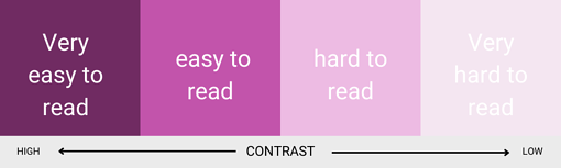
2. Contrast
A simple yet crucial part of design is contrast. Ask a graphic designer, and they would tell you contrast is when two strictly different elements are used together to create impact and direct the gaze. But for branded and digital content in general, contrast plays an even greater role—accessibility.
Yes, content should be visually balanced and not chaotic. It should also be clear, easy to understand, and (hopefully) visually interesting. But you should also make sure that anyone, regardless of their physical ability, can read and understand your content.
And that means ensuring high contrast between text and the background it sits on. Text shouldn’t be placed over patterns; it should be a color on the opposite end of the spectrum from the background it sits on. If you’re ever unsure, ask yourself if the text you’re looking at is as easy to read as it would be if it was black text on a white background.
The same rule should go for your logo. When used, it should always be in the highest possible contrast with the background it sits on.
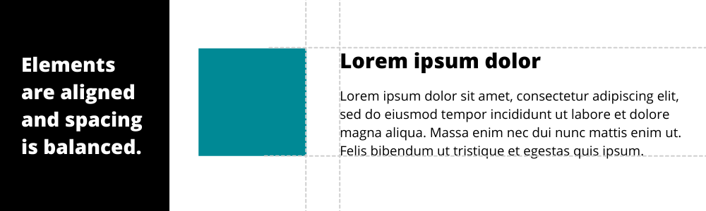
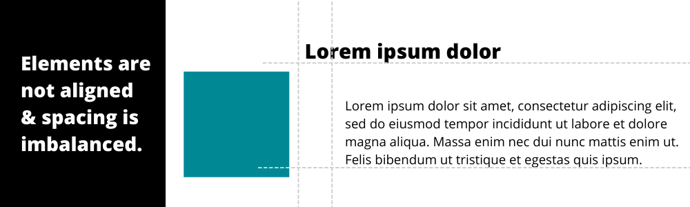
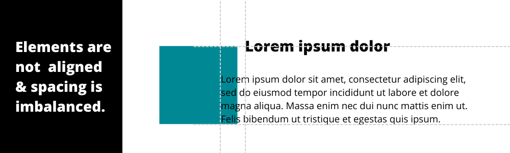
3. Alignment
Another fundamental yet significant piece that will impact the quality of your designs is alignment. To make things easy to understand, you need to use consistent and intentional alignment.
Think about the text, for instance. If you’re using center-aligned text, consider where it is on the page. Does it have a visual component it should align with? Elements can be aligned to any side they share. This could mean all elements are aligned to the left, right, top, bottom, or middle. When reviewing a piece of content, consider whether the design elements are properly and consistently aligned.
4. Hierarchy
Hierarchy in design is exactly what it sounds like, the order in which different design elements should be given importance. Most often, hierarchy refers to size. It is what helps your audience organize the content on the page. Your first instinct might be to make your logo large, but ask yourself, is your logo the most important thing you want people to see? Or is it the message, call-to-action, or image?
When everything appears visually important calling for attention, then nothing is. Use hierarchy to help your viewer receive the right information in the right order.
5. Balance and space
Consider balance and space within the design. Are there elements that feel cramped? Does each element have enough space to ‘breathe’? Web designers would tell you that white space is crucial for helping viewers absorb the content presented to them. If you try to cram too much information into one space, you’ll lose their attention because that information becomes difficult for them to translate. As a rule, each of your design elements should have enough ‘white space’ around it so that it’s easy for someone to absorb the element at a glance.
Content provided by Q4iNetwork and partners
Photo by kengssr1980
![]()